More Happy Clients


With headquarters in Schaumburg, IL, QFW is a leading manufacturer of industrial strength metal float valves and assemblies. Because their products are used in the most demanding applications, QFW implements a multi-stage testing and quality control process to ensure a zero failure rate on all their parts.
As they were expanding into new markets, their logo and branding were due for a refresh. We worked with the company owners to redesign the Quality Float Works logo along with new multi-language letterhead and business cards.

When designing a logo, these are a few of the many criteria we work toward:
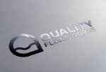
Simple
to ensure people can recognize it as soon as they see it
Scalable and Versatile
able to be scaled down to a small size and still be recognizable, looking good regardless of the digital media or device
Memorable
capture the target audience’s attention, leave a positive impression, stand out in the “brandscape” of competing companies
We also designed a print catalog for their sales team.
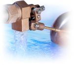
To photograph a valve and float in action, we filled a large, clear tub with water and lit it from beneath with colored gels.
… I was amazed at the creative solution that Harvest Media came up with for our catalog cover. The action shot of the float valve was perfect.
—Jason Speer, Quality Float Works
Industry: Manufacturing
Our Role: Marketing Collateral, Technical Literature, Print Fulfillment

